
How to Use PrimeNG Components with the ABP Angular UI
Introduction
In this article, we will use components of the PrimeNG that is a popular UI component library for Angular with the ABP Framework Angular UI that will be generated via ABP CLI.
We will create an organization units page and use PrimeNG's OrganizationChart and Table components on the page.
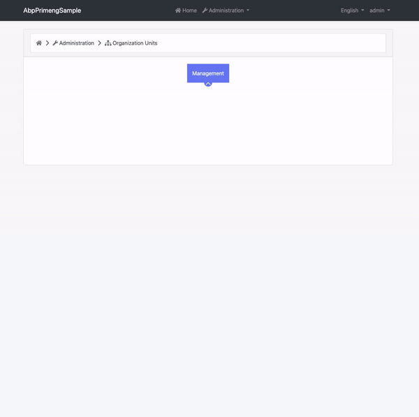
The UI shown above contains many PrimeNG components. You can reach the source code of this rich UI. Take a look at the source code section below.
This article does not cover any backend code. I used mock data to provide data source to the components.
Pre-Requirements
The following tools should be installed on your development machine:
- .NET Core 5.0+
- Node v12 or v14
- VS Code or another IDE
Source Code
I have prepared a sample project that contains more PrimeNG components than described in this article. You can download the source code on GitHub.
Creating a New Solution
In this step, we will create a new solution that contains Angular UI and backend startup templates. If you have a startup template with Angular UI, you can skip this step.
Run the following command to install the ABP CLI:
dotnet tool install -g Volo.Abp.Cli
...or update:
dotnet tool update -g Volo.Abp.Cli
Create a new solution named AbpPrimengSample by running the following command:
abp new AbpPrimengSample -u angular -csf
See the ABP CLI documentation for all available options.
You can also use the Direct Download tab on the Get Started page.
Running the Solution
You can run the solution as described in here.
PrimeNG Setup
Open the angular folder and run the following command to install packages:
npm install
Next, we need to install primeng and required packages (primeicons and @angular/cdk) for the library. Run the command below to install these packages:
npm install primeng primeicons @angular/cdk --save
The packages we have installed;
primengis the main package that is a component library.primeiconsis an icon font library. Many PrimeNG components use this font internally.@angular/cdkis a component dev kit created by the Angular team. Some PrimeNG modules depend on it.
As the last step of the setup, we should add the required style files for the library to angular.json:
//angular.json

"projects": {
    "AbpPrimengSample": {
        //...
        "styles": {
            "node_modules/primeicons/primeicons.css",
            "node_modules/primeng/resources/themes/saga-blue/theme.css",
            "node_modules/primeng/resources/primeng.min.css",
            //...other styles
        }
    }
}
We have added the primeng.min.css, Saga Blue theme's theme.css, and primeicons.css files to the project. You can choose another theme instead of the Sage Blue. See available themes on the Get Started document of the PrimeNG.
You have to restart the running
ng serveprocess to see the effect of the changes you made in theangular.json.
Creating the Organization Units Page
Run the following command to create a new module named OrganizationUnits:
npm run ng -- generate module organization-units --route organization-units --module app.module
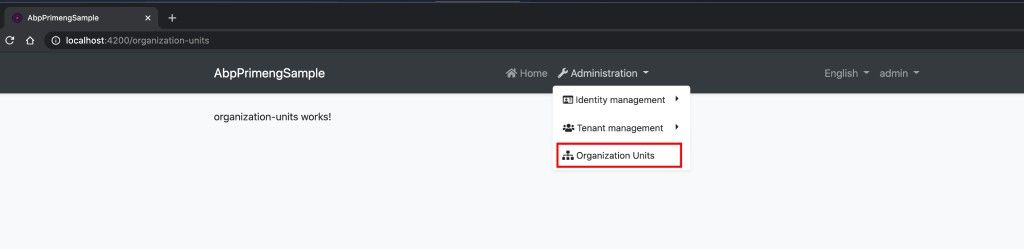
Then open the src/route.provider.ts and add a new route as an array element to add a navigation link labeled "Organization Units" to the menu:
//route.provider.ts

import { eThemeSharedRouteNames } from '@abp/ng.theme.shared';
//...

routesService.add([
    //...
    {
    path: '/organization-units',
    name: 'Organization Units',
    parentName: eThemeSharedRouteNames.Administration,
    iconClass: 'fas fa-sitemap',
    layout: eLayoutType.application,
    },
]);
We have created a lazy-loadable module and defined a menu navigation link. We can navigate to the page as shown below:
Using the PrimeNG Components
Implementing the Organization Chart Component
When you would like to use any component from PrimeNG, you have to import the component's module to your module. Since we will use the OrganizationChart on the organization units page, we need to import OrganizationChartModule into OrganizationUnitsModule.
Open the src/organization-units/organization-units.module.ts and add the OrganizationChartModule to the imports array as shown below:
import { OrganizationChartModule } from 'primeng/organizationchart';
//...

@NgModule({
  //...
  imports: [
    //...
    OrganizationChartModule
  ],
})
export class OrganizationUnitsModule {}
Since NGCC need to work in some cases, restarting the
ng serveprocess would be good when you import any modules fromprimengpackage to your module.
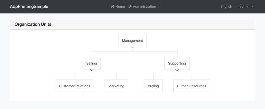
Let's define a mock data source for the OrganizationChartComponent and add the component to the page.
Open the src/organization-units/organization-units.component.ts and add two variables as shown below:
//...
import { TreeNode } from 'primeng/api';

@Component(/* component metadata*/)
export class OrganizationUnitsComponent implements OnInit {
  //...

  organizationUnits: TreeNode[] = [
    {
      label: 'Management',
      expanded: true,
      children: [
        {
          label: 'Selling',
          expanded: true,
          children: [
            {
              label: 'Customer Relations',
            },
            {
              label: 'Marketing',
            },
          ],
        },
        {
          label: 'Supporting',
          expanded: true,
          children: [
            {
              label: 'Buying',
            },
            {
              label: 'Human Resources',
            },
          ],
        },
      ],
    },
  ];

  selectedUnit: TreeNode;
- First variable is
organizationUnits. It provides mock data source toOrganizationChartComponent. - Second variable is
selectedUnit. It keeps chosen unit on the chart.
Then, open the src/organization-units/organization-units.component.html and replace the file content with the following:
<div class="card">
  <div class="card-header">
    <h5>Organization Units</h5>
  </div>
  <div class="card-body">
    <p-organizationChart
      [value]="organizationUnits"
      selectionMode="single"
      [(selection)]="selectedUnit"
    ></p-organizationChart>
  </div>
</div>
We have implemented the OrganizationChart. The final UI looks like below:
Implementing the Table Component
In order to use the TableComponent, we have to import the TableModule to the OrganizationUnitsModule.
Open the organization-units.module.ts and add TableModule to the imports array as shown below:
import { TableModule } from 'primeng/table';
//...

@NgModule({
  //...
  imports: [
    //...
    TableModule
  ],
})
export class OrganizationUnitsModule {}
Open the organization-units.component.ts and add a variable named members with initial value and add a getter named tableData as shown below:
//...
export class OrganizationUnitsComponent implements OnInit {
  //...

  members = [
  {
    fullName: 'John Doe',
    username: 'John.Doe',
    phone: '+1-202-555-0125',
    email: 'john.doe@example.com',
    parent: 'Customer Relations',
  },
  {
    fullName: 'Darrion Walter',
    username: 'Darrion.Walter',
    phone: '+1-262-155-0355',
    email: 'Darrion_Walter@example.com',
    parent: 'Marketing',
  },
  {
    fullName: 'Rosa Labadie',
    username: 'Rosa.Labadie',
    phone: '+1-262-723-2255',
    email: 'Rosa.Labadie@example.com',
    parent: 'Marketing',
  },
  {
    fullName: 'Adelle Hills',
    username: 'Adelle.Hills',
    phone: '+1-491-112-9011',
    email: 'Adelle.Hills@example.com',
    parent: 'Buying',
  },
  {
    fullName: 'Brian Hane',
    username: 'Brian.Hane',
    phone: '+1-772-509-1823',
    email: 'Brian.Hane@example.com',
    parent: 'Human Resources',
  },
  ];

  get tableData() {
  return this.members.filter(user => user.parent === this.selectedUnit.label);
  }
What we have done above?
- We defined a variable named
membersto provide mock data to the table. - We have defined a getter named
tableDatato provide filtered data source to the table usingmembersvariable.
We are now ready to add the table to the HTML template.
Open the organization-units.component.html, find the p-organizationChart tag and place the following code to the bottom of this tag:
<div class="p-3" *ngIf="selectedUnit">
  <h6>Members of {{ selectedUnit.label }}</h6>

  <p-table [value]="tableData">
    <ng-template pTemplate="header">
      <tr>
        <th>Name</th>
        <th>Username</th>
        <th>Email</th>
        <th>Phone</th>
      </tr>
    </ng-template>
    <ng-template pTemplate="body" let-member>
      <tr>
        <td>{{ member.fullName }}</td>
        <td>{{ member.username }}</td>
        <td>{{ member.email }}</td>
        <td>{{ member.phone }}</td>
      </tr>
    </ng-template>
  </p-table>
</div>
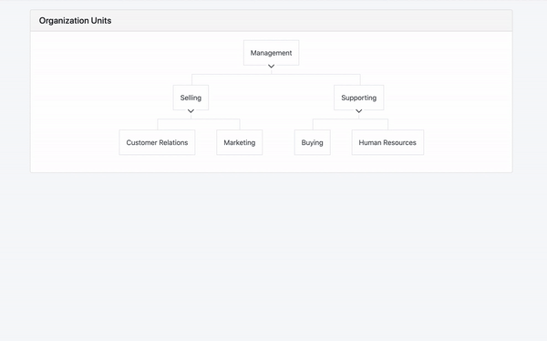
We have added a new div that contains the TableComponent. The table appears when an organization unit is selected.
The table contains 4 columns which are name, username, email, and phone for displaying the members' information.
After adding the table, the final UI looks like this:
Conclusion
We have implemented the PrimeNG component library on the ABP Angular UI project and used two components on a page in a short time. You can use any PrimeNG components by following the documentation. The ABP Angular UI will not block you in any case.
kien nguyen 3 weeks ago
hi Erim I have issue when using primeNG with ABP. I added <p-dropdown> in <abp-modal> because I want to use seach in dropdown. Can I use both component of PrimeNG and ng-boostrap in a file ".component.html". I can't upload image in this comment. Thankyou very much
dinhtona@gmail.com 2 weeks ago
Try: <p-dropdown [filter]="true" [options]="dropdownItems" [(ngModel)]="selectedItem" optionLabel="label" [showClear]="true" optionValue="value" placeholder="Select an Item"></p-dropdown>